It's a tepid day here in Cleveland and the late Winter snow has given way to cozy spring rain. I sit at my desks now, windows open, with the scent of wet earth on the air and the sounds of Cafe LeBlanc filling my ears.
Hello reader - and a big hello and happy birthday to my brother, Tylor! Welcome to my second project postmortem.
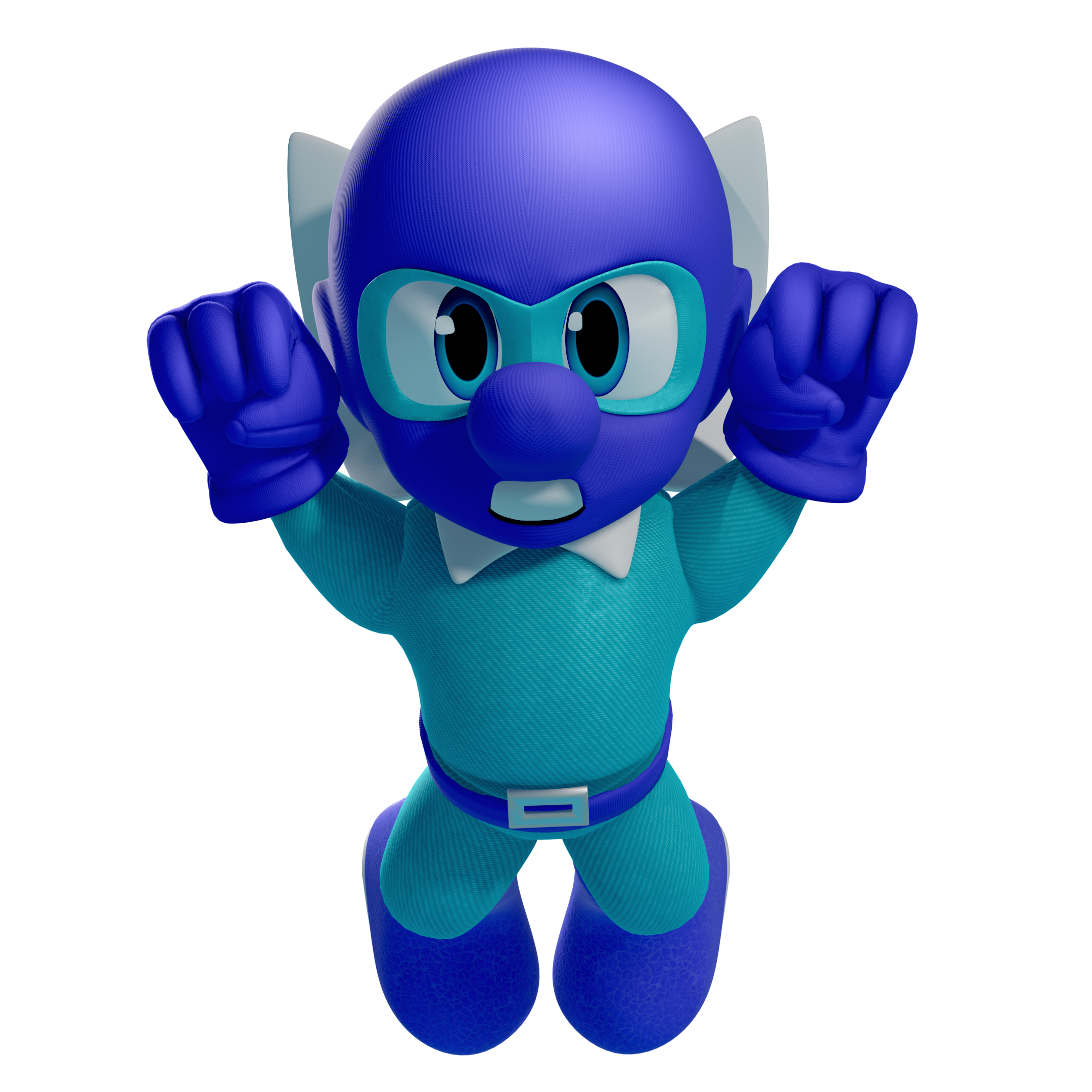
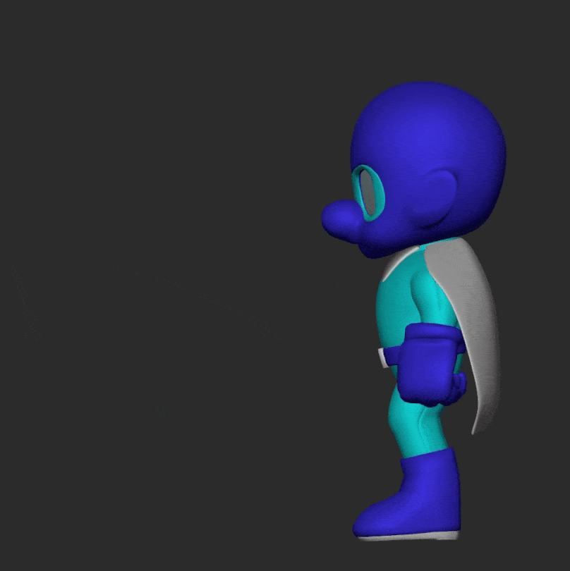
This time, I will be discussing my big brother's big birthday gift - the "Tylor Lilley" direct - in which I tried my best to create a "Smash Brothers Ultimate"-style character, some fake gameplay, and a fake Nintendo Direct presentation.
Two months ago, I made a stronger commitment to my relationship with art. I have decided that I am tired of waiting to create work that I can honestly be proud of. My only desire is to play a role in the creation of work that can speak to the human spirit. Right now, I am a runner at the starting line. I spend most nights training my form. I throw myself into my work and see what happens - hopefully, getting a little faster each time.
This project might not move just anyone's human spirit, but hopefully, Tylor - It moves yours! In all, I spent about one month on this project. I don't write this to emphasize it's difficulty, but instead to illustrate my belief that one month actually isn't so bad for the myriad disciplines contained within. Actually, I feel as if it was the perfect amount of time for me to take what I needed from it.
My north star was to create a Smash-style character "the way that Nintendo would do it," which includes all the little steps that can be often be cheated or skipped in some workflows. Including proper game-ready retopology, textures, and rigging.
The scope was a bit larger than that in the context of the "fake direct," which I will be glossing over most of for the purposes of this article. Instead I'd prefer to focus on the main event: creating the character. Suffice to say that the rest of it would not have been possible without the free resources provided by the model, texture, sprite, and sound resource catalogs of ripped game assets - hosted for free by volunteers at the VG resource since at least 2003, and used by me and my brother since we were children.
Overall, I'm quite happy with the results! They're a little janky, sure, but I learned a lot and it was a lot of fun. As you can see below, I will be breaking the project down in exhaustive detail. I hope that this gobbledygook can be interesting to even those less familiar with the technicalities of the 3D pipeline, and I will try my best to keep it relatively high-level.
Without further ado - let's dive in!
[TOC]
Design & Reference
My first task was arguably the most difficult (and the area where I still stand to improve the most) the design of the character!

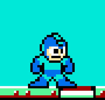
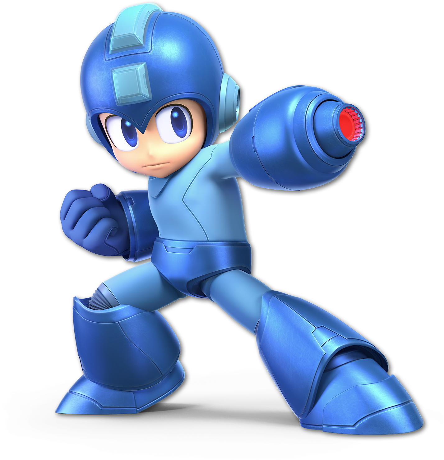
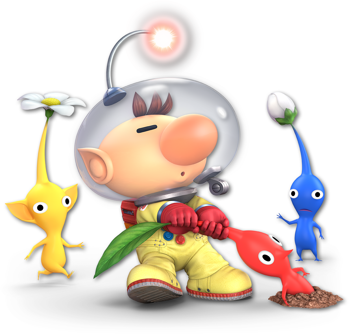
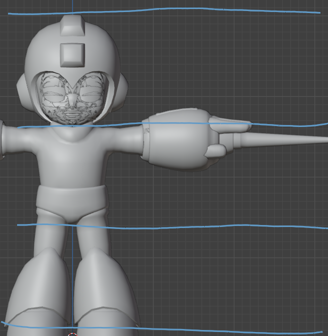
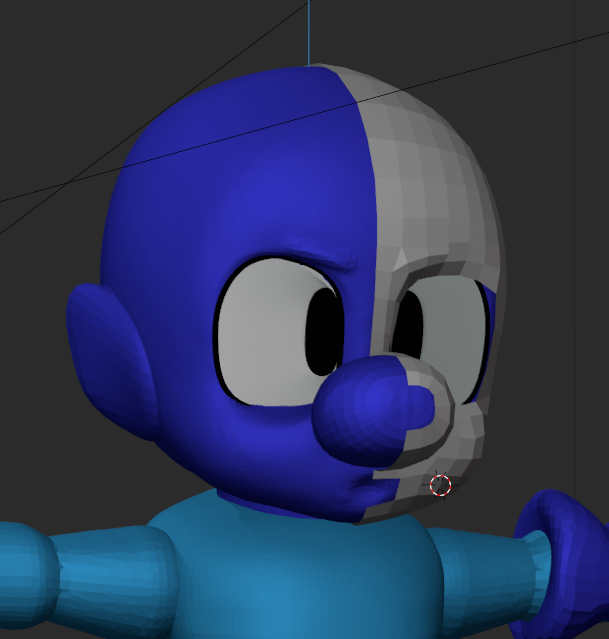
I don't think it's a stretch to say that the core design of Mighty Dive Bomber is not unlike another famous Blue Bomber, so it seemed as good a place as any to start. I've always been quite fond of Nintendo's attention to detail in the designs of their "classic" characters. Especially so with Mega Man's design. It's simply a masterclass in doing exactly what I want - modernizing a design based on just a few iconic pixels.
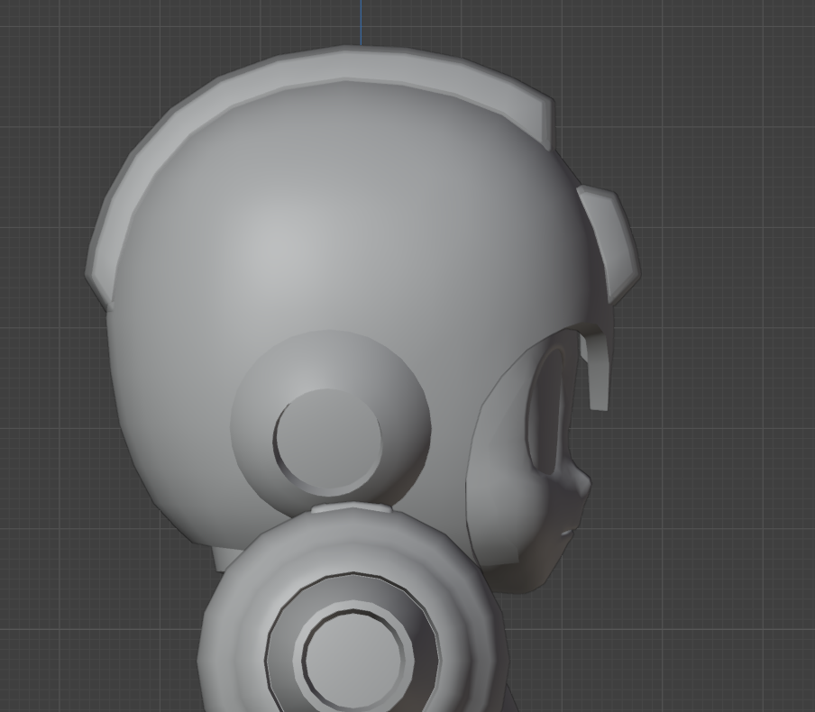
I spent most of January sculpting heads, so I paid special attention to the face when gathering my references. I was interested in what choices were being made at Nintendo to "stylize" a head. This will be relevant in the upcoming blockout phase.
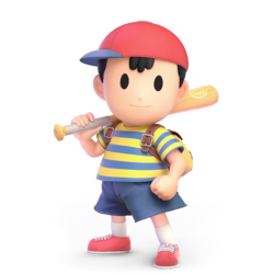
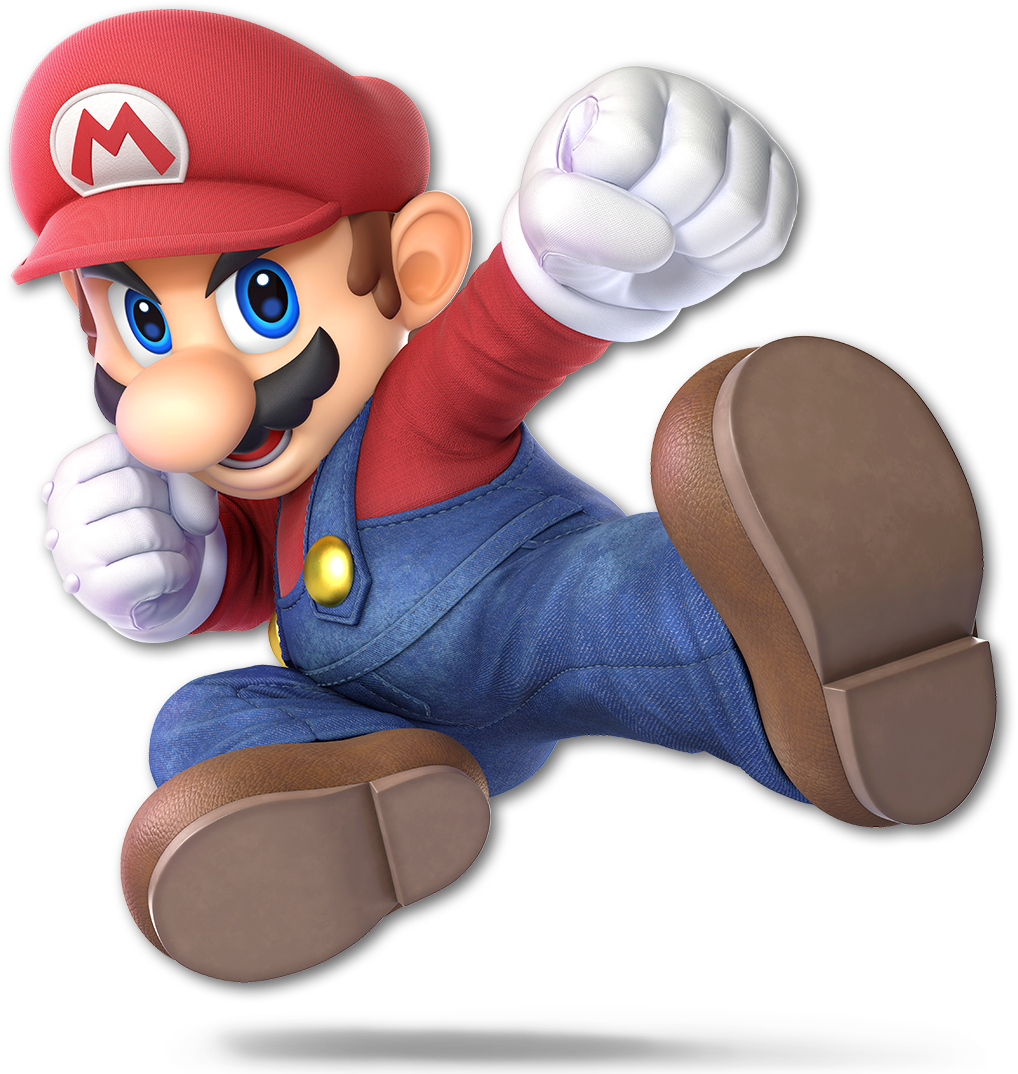
Though I started at Megaman, I eventually ended up a little closer to Mario for the proportions and materials, with maybe a dash of Olimar.
As I continued to gather references I made one, single, massive oversight. I neglected to do the "design" part of the design phase.
I had vague ideas and lots of reference, but no true sketches or ideas about how I wanted the final design to look. This ended up being a double-edged sword - as it forced me to learn a lot "on the job" but I believe that the lack of direction absolutely hindered my final design. I not only wasted a lot of my time in ideation but hurt the overall look as I didn't quite achieve what I saw in my head.
It can't be overstated how important it is to have even a vague idea on paper of a final design first, and then work towards it. I will die a proponent of being loose and willing to wander from your design, but at least for an artist of my skill level, I feel it is necessary for long-term commitments. (Unfortunately for me.)
Blockout
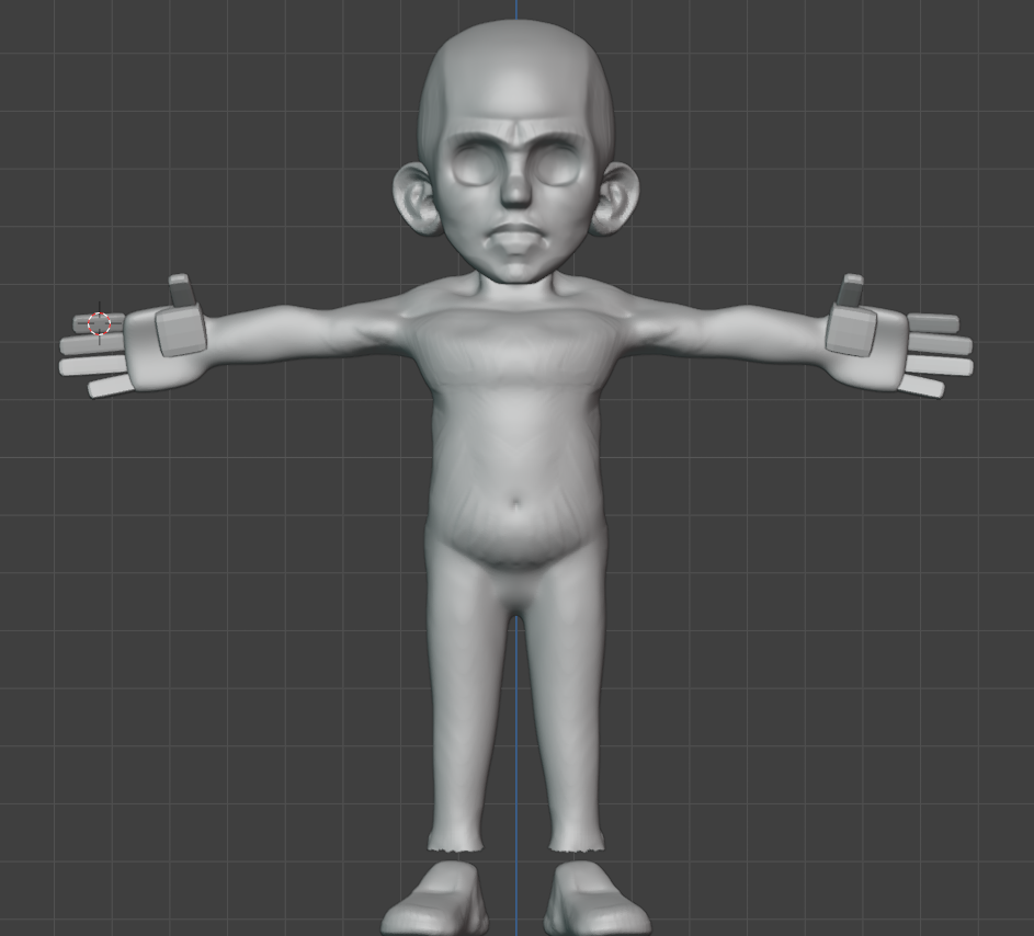
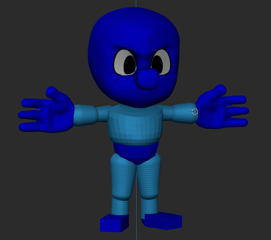
Regardless, I was eager to start pushing polygons around with my new-found sculpting knowledge and I moved right along to what 3D artists refer to as the "blockout" phase.
In a blockout, the artist's goal is to focus on big forms, shape language, and proportions. Here, I try my best to avoid getting stuck on details or single areas by keeping zoomed out - always moving around the model and checking the silhouette against it's reference.
It's here that I must confide in you a failure of mine. In spring of 2023 I attempted to make a similar project for my brother based on the protagonist of another of his games, "EIH." He had recently finished the project and I wanted to surprise him with some cool character art based on it. As you can see, the results...well...
...they were terrifying. I contemplated playing up the horror element, or doing a funny joke about bad 80's box-art recreations of classic characters like the infamous boxart Megamen.
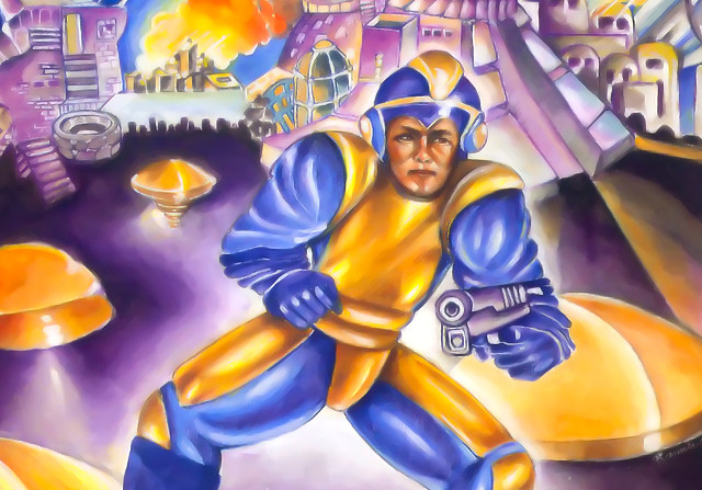
Ultimately, I dropped the project. I see now that it suffered from the same flaws those 80's boxarts had - a poor design that took what should be a stylized character and made it "too real" by giving them all sorts of weird anatomical detail.
This time, I was determined to strike the balance between big, cartoon-y shapes and just a dash of anatomy.
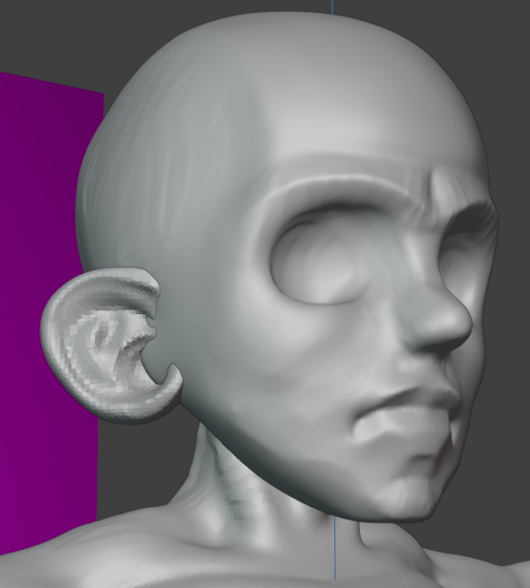
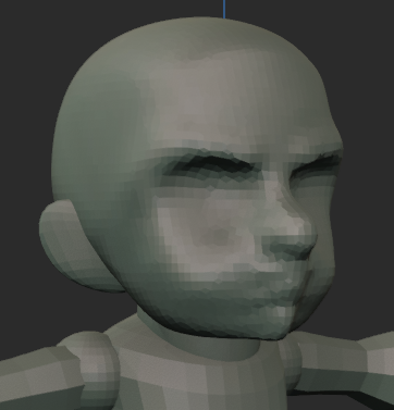
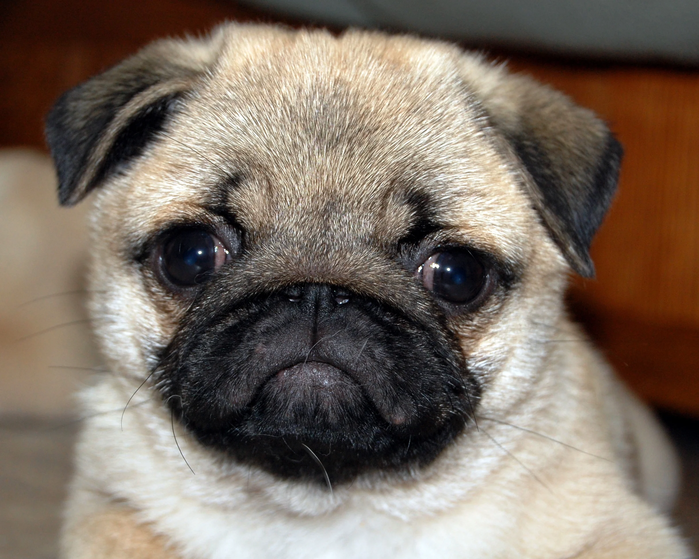
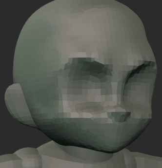
At first I feared I was heading down the same path as 2023, until I had a big breakthrough re: stylized and anime-like faces. The features are bigger and smushed towards the bottom of the skull, yes, but most importantly they are FLATTER! Like the face of a cute pug.
You can see in the second image above that a lot of the same issues as my 2023 sculpt were forming, the jaw is pushed forward giving the effect of a grumpy man puffing his cheeks out. The anatomical detail was too high. Instead, after flattening the face and sanding off a few of the features, I was already much happier with the direction.
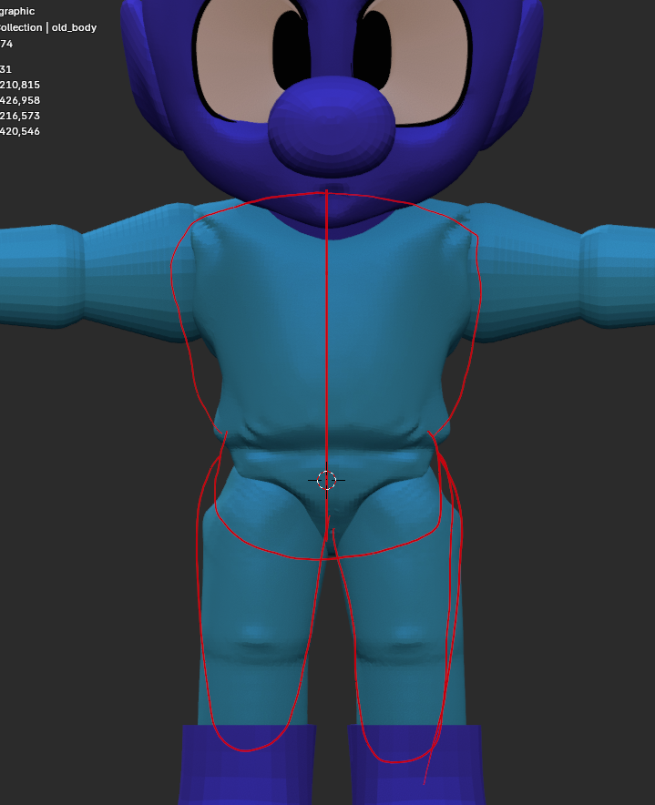
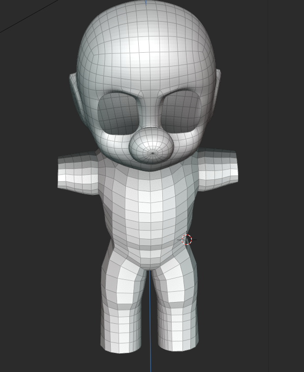
Next up was the body - and here my lack of a design reared it's ugly head. What were the proportions of this character?
A common reference artists use when measuring proportion is the "number of heads" from top to bottom, seen below.
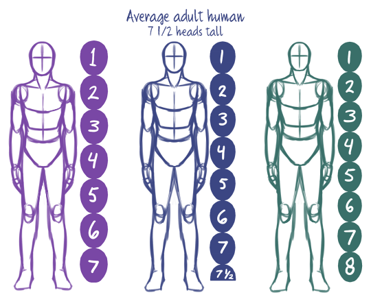
Anatomical humans are 7-8 heads tall, but stylized characters vary. For example, Smash Ultimate's Mega Man is roughly 3 heads tall so I aimed for that. I always imagined MDB as a very squat little guy however, so I spent a ton of time tweaking the proportions and trying to push them. Below, you can see the difference between a two-head and three-head MDB. Ultimately, it didn't feel very "Smash Bros," so I ended up walking it back.
This demonstrates once again the challenge of not having a design to work from. I spent a lot of time moving things around - how big should the skull be? What should the head-to-body ratio be? How about the eyes, hands, and feet? What is the shape language I'm using to define areas? These things would have had answers sooner if I gave them answers to begin with.
This would only continue to be an issue for me as I moved along to...
Refinement
Refinement! The boarder between blockout and refinement is pretty nebulous, but generally when you're happy with the big forms and proportions you're good to start doing the fun part (details!)
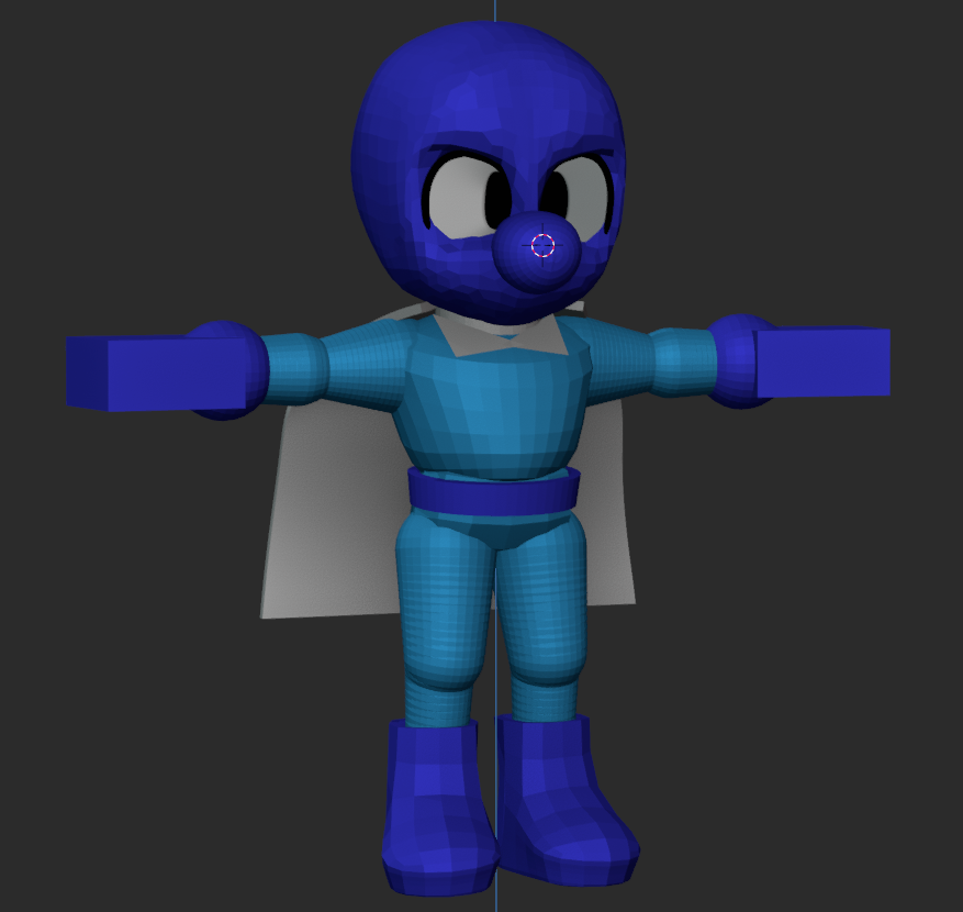
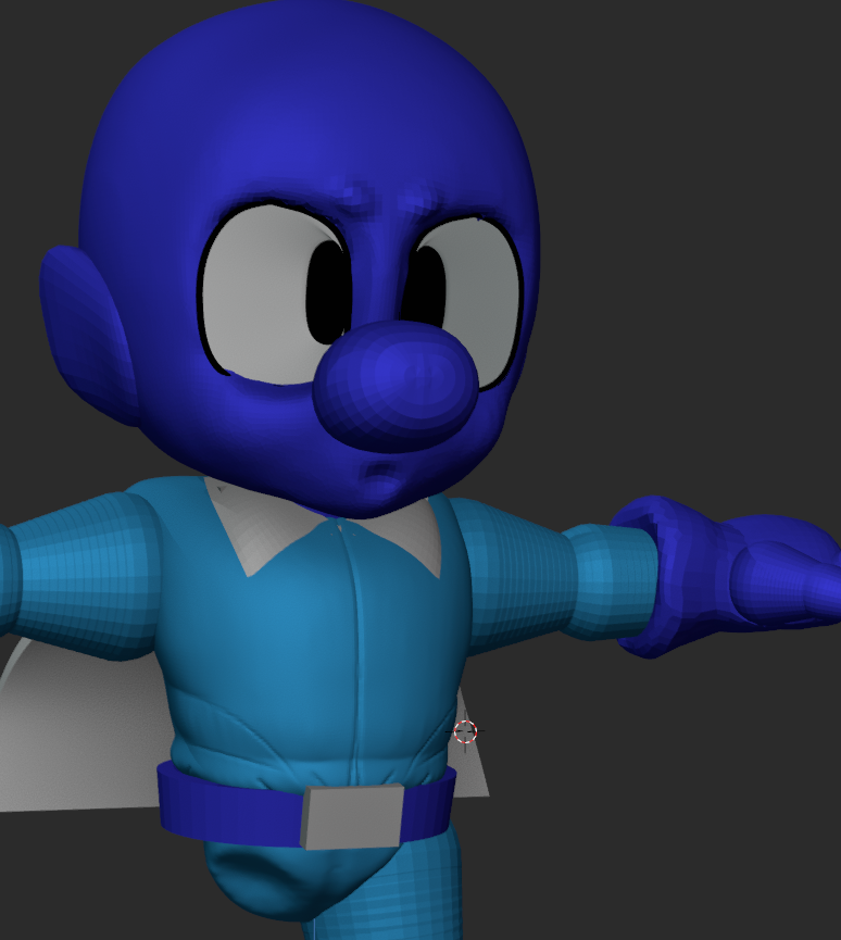
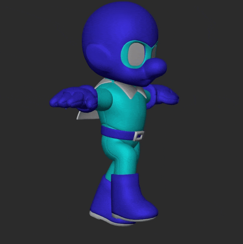
Here I began to really think about what I was sculpting. Mighty Dive Bomber is a little blue guy...but why he the way that he is? Mega Man is made of perfectly undisturbed, cold metal primitives. Is Mighty Dive Bomber made of flesh and bone? Does he wear clothes? What are the two cyan pixels on the side of his head meant to represent?

I settled on a few bits I wanted to aim for - taking reference especially from his "classic" design. He's a guy wearing a work jump suit. He got a sort of full-head nylon mask with a second super-hero eye mask over top of that.
Now the question was this - how important are these details? Specifically which details are important enough to break the silhouette of the character? I wanted to set him apart from Mega Man's clean primitive shapes so I brought the forms of the jump suit out prominently to feel baggy and loose in contrast to Mega Man's cold metal construction.
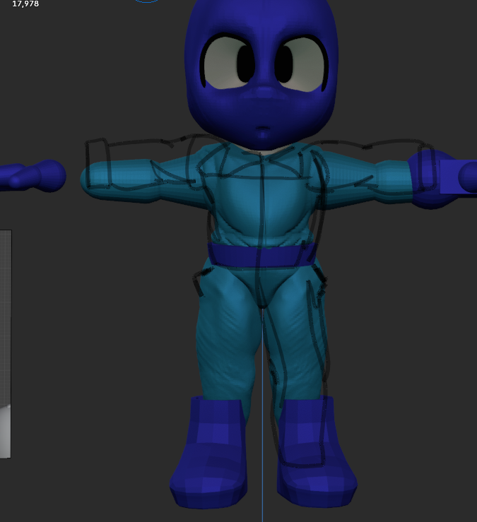
As I tried to break up the silhouette, however, I began to feel that something was lost. Then, a friend helpfully pointed out that something was indeed lost - volume! My detail work was mainly subtractive, which made the character feel skinnier.
Above you can see the beginnings of my detail sculpt overlayed with the outline of the original blockout. Part of the charm of these Nintendo cartoon guys is their squatness and simple shapes - so I tried walking it back. I tried to stride the line between big simple primitives with details that do not break the silhouette vs. big shapes that do.
Eventually, I relented and lost the details completely for the safer waters of big colorful shapes.
Something else this project is teaching me is what I value as an artist. I make a lot of decisions throughout this process to move me towards my goal - a "nintendo"-y, video-game-y character, and in doing so I'm learning what I do and do not like about this style
I think I walked it back too much in no small part because it felt more "Smash Brothers" to me - but in hindsight I quite liked the detail I had going on and think I could have kept at least some of it.
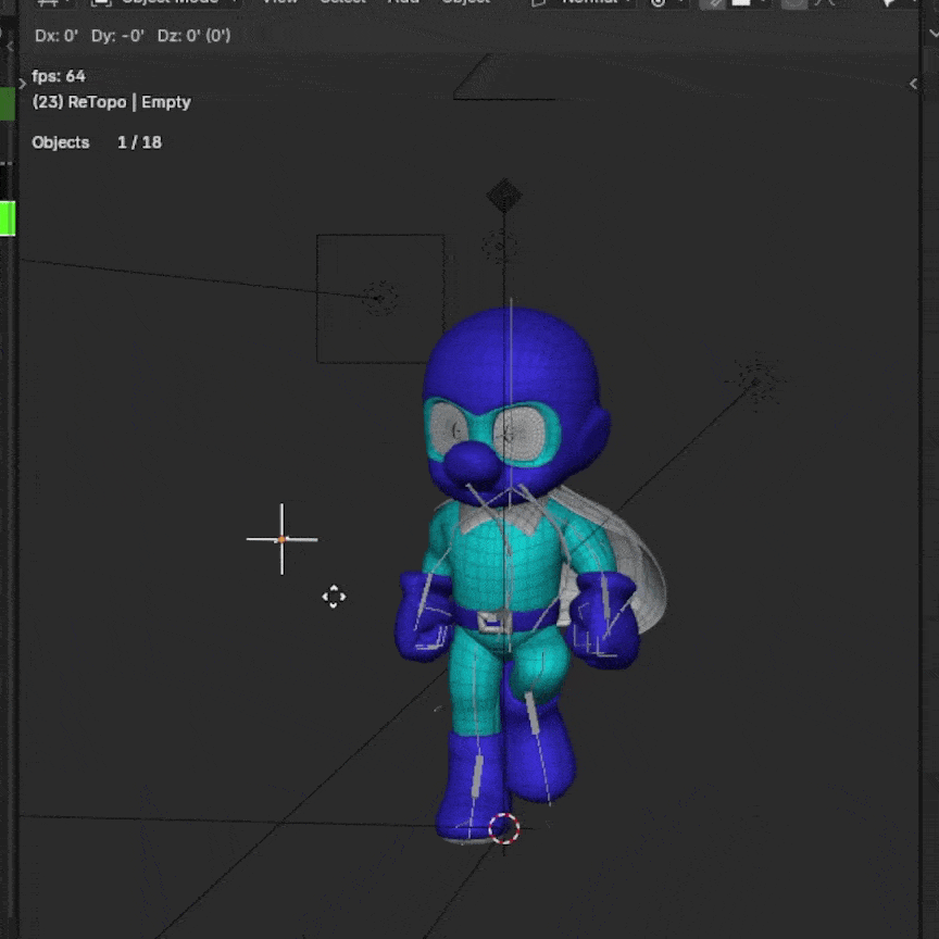
Retopology
Next began the foreboding process of "retopology." This is about where the project stopped being about art and starting being about computers. Strap in!
All digital 3D objects are made of polygons, which you can conceptualize as groups of points in 3D space. Akin to drawing with a three dimensional graphing calculator: an object can be represented by connecting a bunch of points on the x, y, and z axes. This is how they used to do it, in fact - Crash Bandicoot was created by artists manually programming each point (or vertex) of his body in 3D space and then charting several hundred of those points in motion using maths.
Nowadays, tools have given artists much easier ways to interact with 3D art. Today's 3D artists can simply add, subtract, and shape polygons like a traditional artist would do with clay. Unfortunately, this requires a lot more (and more messy) polygons in order for the tools to react the way we expect them to. So, the final model is dense and the flow of it's polygons loses it's mathematic perfection.
This poses a problem for the rest of the pipeline. When we ask the computer to do all that math the people used to do without proper, mathematically-perfect polygons - it can't parse what we're asking it to do in a clean fashion.
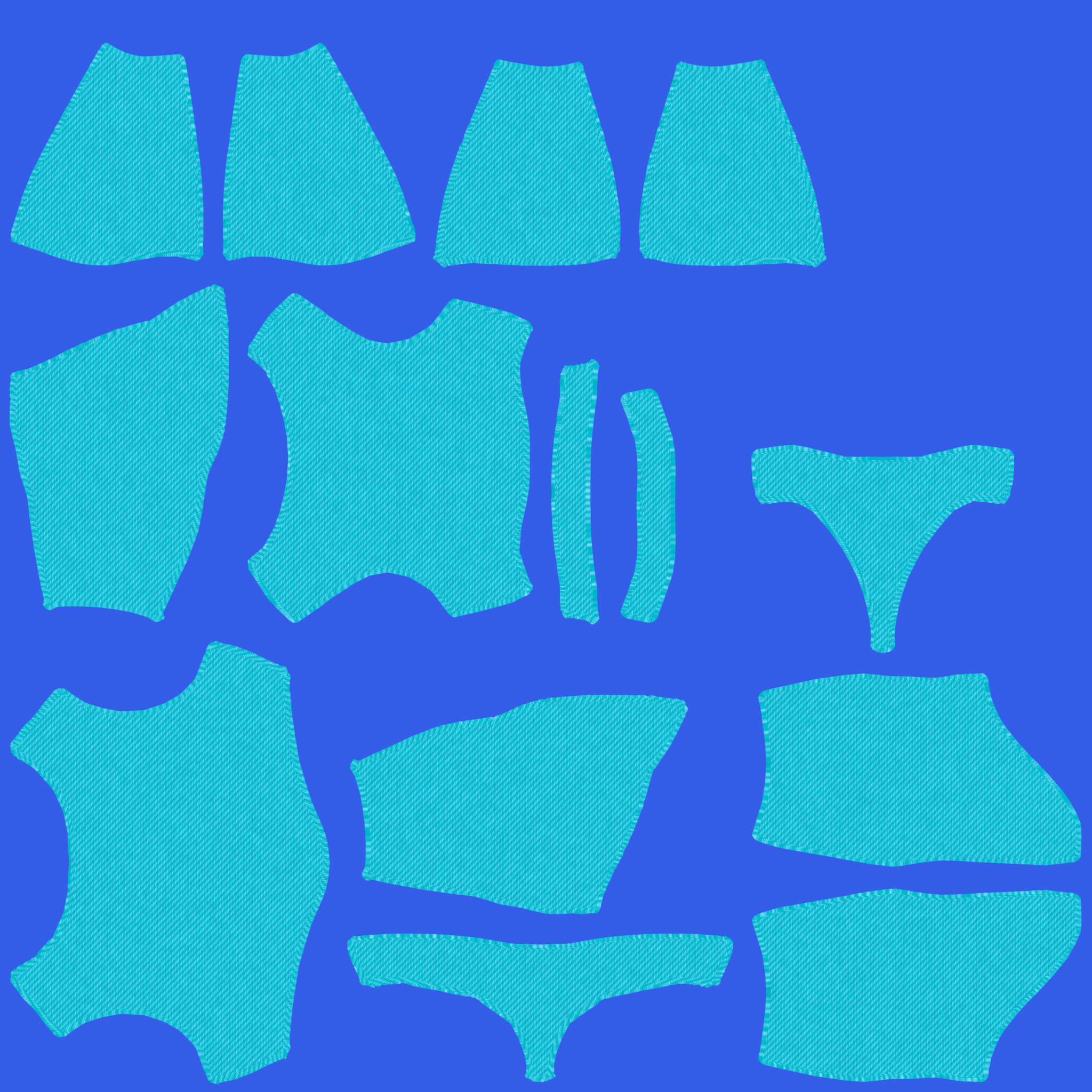
Enter: retopology; or the process of 3D artists laying a clean blanket of polygons over their messy sculpture. There are dozens of tools out there that will do this process for you, and they will suffice in a lot of circumstances, but for video games we still manually retopologize models to have direct control over the flow and density of their polygons. Since I'm dong this "the way that Nintendo would do it" I figured I would ditch the automated tools and just go for it.
Of all the steps in the pipeline this is the one I've understood as one of the least popular. Artists of all stripes bemoan retopology as a tedious and fickle process - but to be completely honest, I didn't mind it at all.
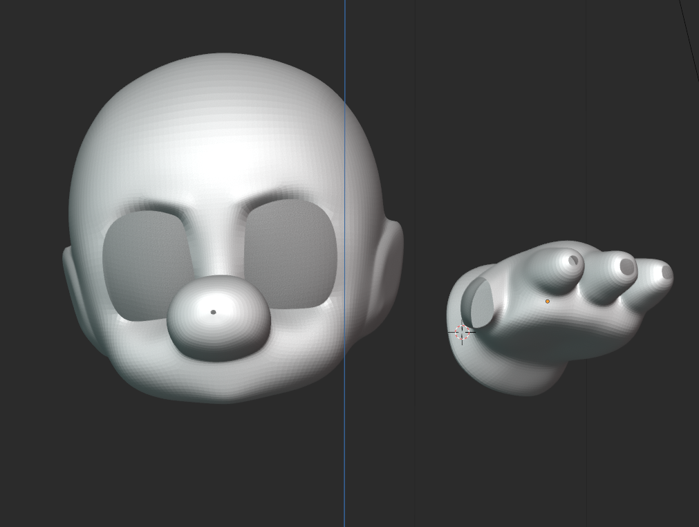
It was completely painless. I made the usual support strips around big opening like eyes and around the circumference of the subject and then simply filled in those gaps in a grid. Unlike a lot of the other parts of any artistic project - there is a "correct" way to do topology, so I found it nice to have definite questions and solutions.
You can see above that I was afraid of poles and unsure how to seal them properly. I kind of just made the openings really tiny and then grid-filled them as to not break the shading too much, which is absolutely not the correct way to do it.
Here, another of my big takeaways came into focus. It's easy to think of this process in the way I've laid out this post - a pipeline. I wished to break myself of those confines. I moved into retopology perhaps a little sooner than I should have, with the intention of going back to shift forms in sculpt mode after retopo.
The hands for instance were not refined before I started retopology on them. Even later in the pipeline, I started to feel comfortable hopping back and forth between these steps as needed. Need to tweak the rig after I've started animating? Not a big deal, as long as it doesn't erase already-finished work, I can move back and forth as much as I please.
Is it the most efficient way of working? Maybe not. But I truly see being flexible here as a boon, not a detriment. Over all, the manual retopology was 100% worth it for the effort, and I was quite pleased with how crisp the forms looked afterwards.
Materials
With that out of the way, I was eager to move into materials. Smash renders have such elegant and subtle texture work that I tried my best to mimic.
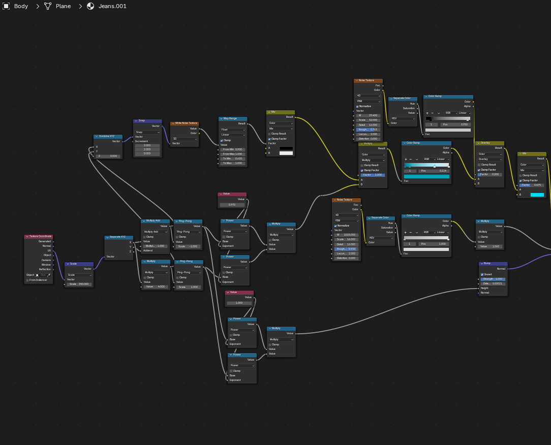
I won't bore you with the details of the shader graphs, but the general idea is that almost all textures can be generated with gradients, noise, and a bit of math. Above is my shader graph for the procedural jean-like fabric I ended up going with for the chest. I originally had a softer weave fabric, like so...
...but thought it gave the clothes more of a pajama feel than the work-wear I was going for.
The idea was to get as far as I could procedurally and then bake the textures and paint on top of them, but one thing led to another and I never got around to the painting pass, so I just baked the procedural textures as is.
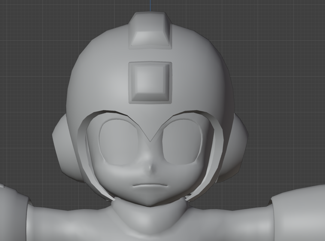
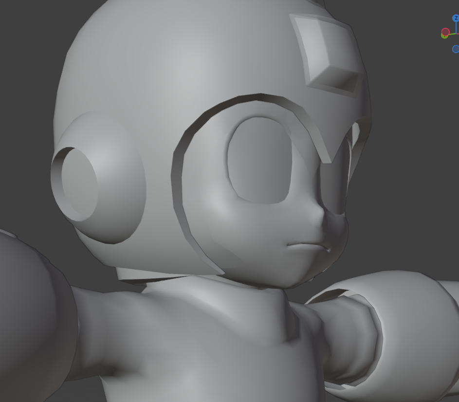
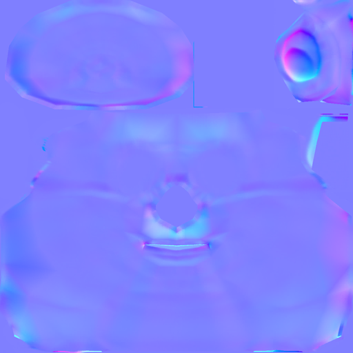
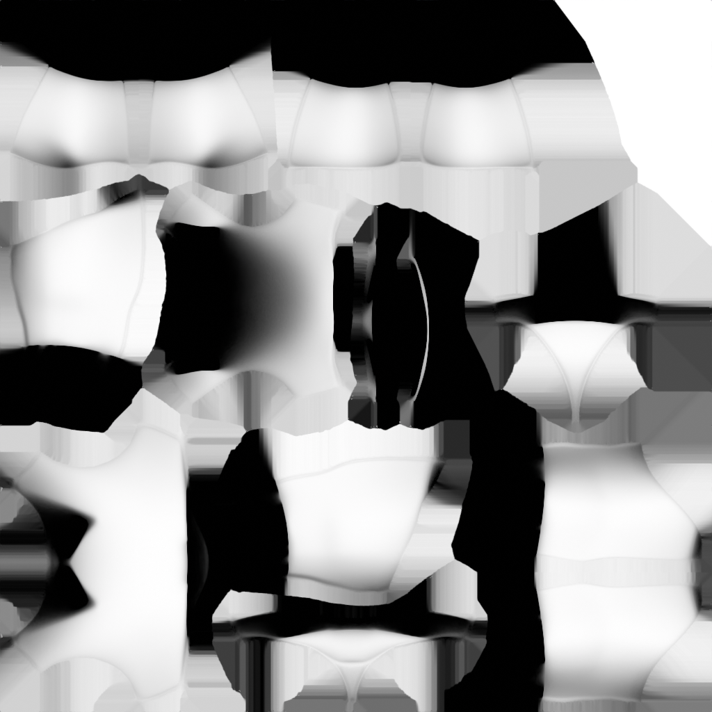
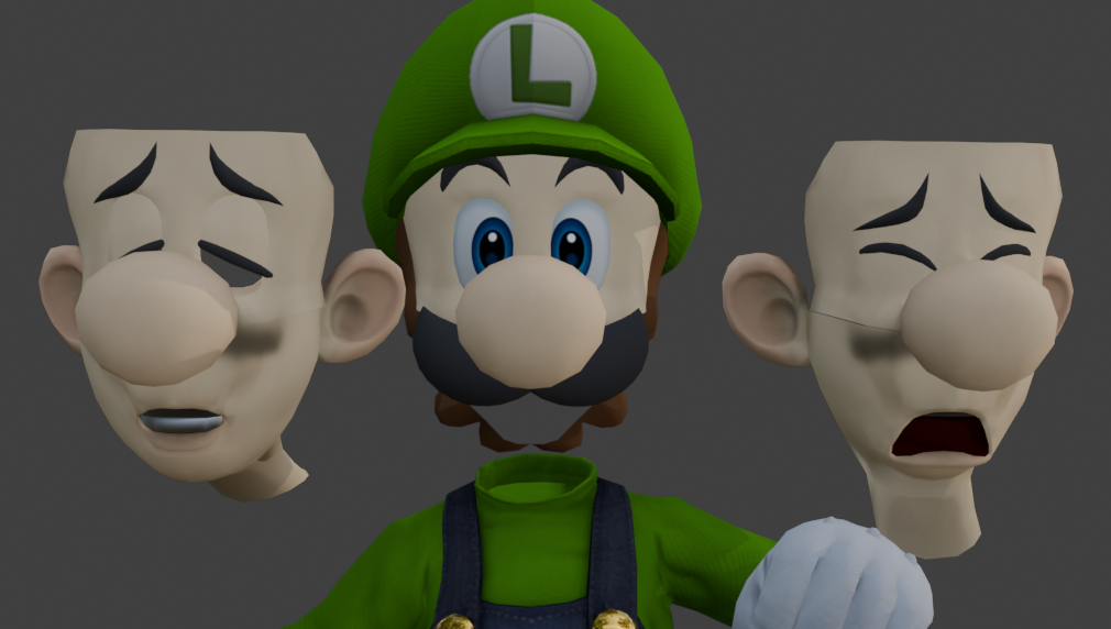
3D Objects can have all sorts of different passes - each with a different role to play. The normal map (the purple one) effects the surface depth in texture space, adding details that don't need to be present in the model's geometry. See below for just four of Luigi's eight texture passes on just his face alone.
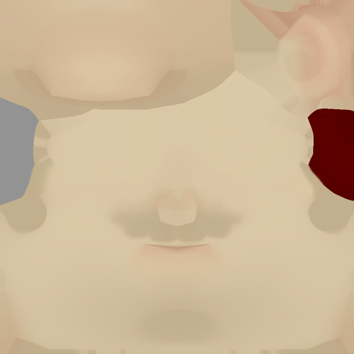
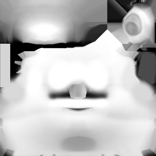
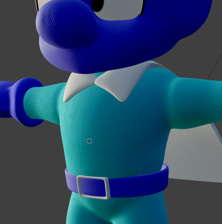
As I imported the original Smash Ultimate textures for the Luigi model, I quite liked the amount of detail the Ambient Occlusion (right) pass gave the model. AO passes simulate a lack of light in the natural crevices of the model as they may appear in real life, in areas like behind the eyes or under the head. I liked them so much I ended up baking some for MDB as well. Here's some of the baked Mighty Dive Bomber materials.
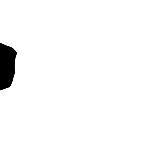
Another small thing I learned and will definitely be stealing from Nintendo for future projects is this little image right here:
Which is a normal map applied to characters' eyes that gives them a rounder and softer appearance that I like a lot. In fact, I just stole Luigi's and gave it to MDB.
As I type this now - I'm realizing I completely forgot to bake my roughness maps. Ah, well.
Rigging
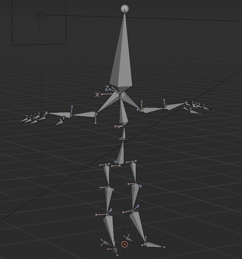
Next up was rigging the model!
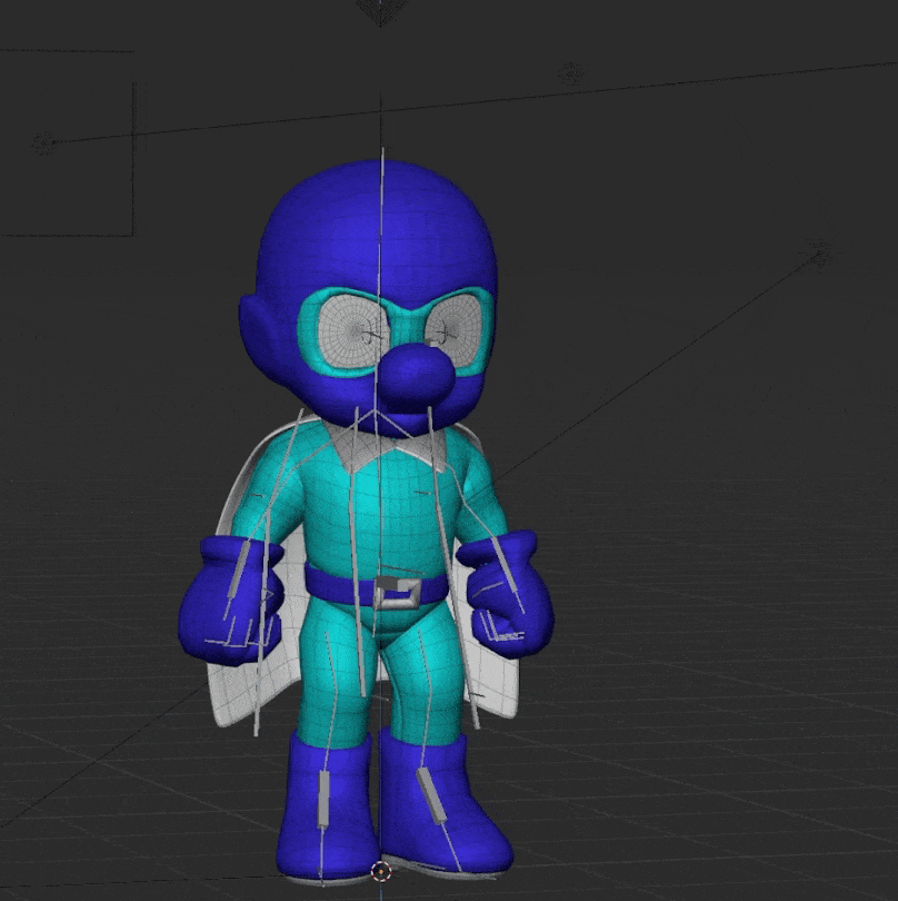
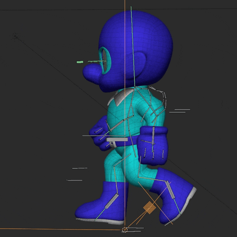
Remember how I described the process above in which 3D artists used to chart each vertex individually in 3D space manually? Well, since at least the 90's we've had a better solution to this problem - bones! Pictured above is the skeleton that lies within Mighty Dive Bomber.
That skeleton is set of bones just like yours or mine. Each bone contains a set influence (or "weight") on it's surrounding vertices, determined by it's weight map. Then, those bones are parented to one another in a hierarchy. Just like our bones, they are acted upon by set constraints. Moving your hand? Well, you're likely moving your elbow and shoulder! This takes the once nightmarish process of moving every vertex manually with math and makes it as simple as puppeteering the bones to perform as an actor might.
Joey Carlino's Youtube channel was an invaluable wealth of information for me from this point going forward - but especially here in the rigging stage. I've more or less lifted his hand and foot IK rigs one-to-one from his tutorials and they helped me get very user-friendly rigs that were custom made for this character, with no extra cruft I wasn't using. This helped me immensely when it came time to animate. Joey makes fantastic use of the snapping, renaming and symmetry tools to avoid doing double-work and it made building the rig a breeze.
Personally, I've come away from this project thinking that next time I need a rig - I'm going to do what I've done here and make it myself. There are dozens of rigging tools and pre-made rigs you can use, but the ones you create will always serve your needs better as they are created by you do exactly what you want them do and nothing else.
A couple things I learned here: each bone has a "roll" value that determines it's facing direction and how it will rotate around it's major axes during animation. I hadn't thought about it like this before, but this value is integral to the usability of your rig. You want your transforms to be extremely clean, so set your rolls to major axes (0, 90, 180 degrees) and avoid too many extra rotations wherever possible. This means that when you go to animate your rig, when moving a bone 90 degrees on the X axis, the model will follow suit. Exactly the amount you want on exactly the axis you want.
In my rig, for instance, you can see the legs are a little bowed outwards, so the leg chains aren't facing exactly 90 degrees forward. This was a pain in animation later, as my rotations weren't super clean and readable values.
Another important thing to keep in mind when rigging is that these are your only animation controls, so anything you want to do should be baked in here. For instance, I regretted later not making a more robust foot rig with toe pivoting constraints that would help me to snap the foot on and off the ground.
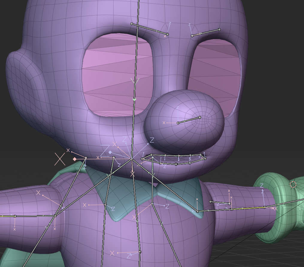
An idea I toyed with here was giving the character facial rigging around the brows and lips, but this ended up being too much trouble for this project. It was a lot of tiny bones in a tiny space, and weight painting was already giving me a lot of trouble. Instead I opted for what Nintendo does in Smash Brothers - a process known as mesh-swapping. Many versions of the same mesh are parented to the same bones and then simply swapped on and off as needed. Below are just a few of the dozens of Luigi face-swaps.
Another technique I lifted from Joey Carlino was a clever little eye rig. In Nintendo games, much like the faces, the eyes are simply baked to textures and swapped as needed. I wanted a little more flexibility than that.
The most common approach for non-texture-based eye rigs is to do it the way that our eyes function: spin a sphere in our head to point where your eyes are looking. The problem with big stylized eyes, however, is that they aren't exactly spheres and they don't exactly move. Nintendo faces have the eyes as flat planes that are just sort of stuck to the head like a sticker.
Joey's clever solution is to parent the bones to empties, which are then shrink wrapped to the eye mesh. Then, the eye is procedural generated based on the position of the empty relative to the eye, allowing a lot of flexibility - without ever needing to move the eye.


A nice bonus of this method is that the eye textures can be baked like any other, and since we're not messing with any transforms you can simply spit out as many different eye textures as you want. I didn't really end up using this part of the rig much at all, but I still found it a really clean and flexible solution I will be using again in the future.
Weight Painting
And now, a brief Weight Painting aside. As described above, the "weight" of a bone simply determines how much (if any) influence moving that bone will have on the surrounding vertices. Here is an excerpt from the notes I made following a couple days of weight painting:
*EUUUUUUUUGHHAHRUGHASDUH the mos tpainful thing ive ever done in Blender bar none. So many toggle and switches and they all do slightly different things. took me forever to figure out that tool symmetry and general vertex symmetry were different. always keep tool panel open and be conscious of where you're painting (or not painting) - and it really is painting, go slow, subtle, small changes. subdiv after armature in mod stack for smoother deformations - "preserve volume" for nicer forms. no easy fix. "easy weight" addon for weight group symmetry, a million percent worth it. nightmare. absolute nightmare. *
As you can see, I did not enjoy this process. I'd have to agree with my past self here - weight painting was by far the worst part of this entire project. In part because I was not familiar with the tools (I did get better as time went on) but also because it is generally an arduous process that is prone to breaking completely. It's extremely easy to lose work by overwriting it in another bone or messing up the symmetry of your model. It felt like a tower of cards I was continuously knocking clean over.
Most difficult for me was a stupid battle I was fighting with the weight of the cape. It needed to deform in a very specific way that gave it a cloth-like feel while remaining attached at the neck of the character.
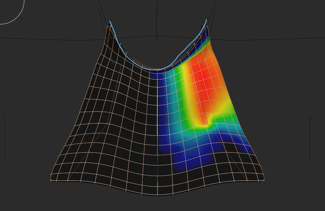
The cape is a simple deformed plane with no thickness until a "solidify" modifier is applied which gives it juuust a bit of thickness. Originally, I had applied the modifier before rigging, meaning that the front and back side of the very-thin cape were constantly fighting one another causing all sorts of strange clipping and other issues. I eventually discovered that I can simply "solidify" after the rig effected the model, saving me a lot of headache.
I did eventually find the add-on Easy Weight which was created by Blender's own internal studio (Blender Studio). It helped the process immensely, allowing for better control over what I was painting and also allowing me to easy copy weights from one side of the model to another.
0/10 would not recommend this sucked. (But you kind of have to do it.)
Animation
And now for the final step - and truly the reason I am so invested in 3D character art to begin with - animation! I come from an animation background, and any artist can attest to daydreaming up complex animations of fight scenes or music videos, so It's always been my raison d'être. I will admit that I am stubborn, but animating other people's characters doesn't sit right with me. I want my animations to be mine and mine alone...unfortunately, that means there are a lot of steps between me and animation on most projects.
Needless to say, I had a blast with this and I hope to do more 3D character animation in the future. I began with the process known as pose-to-pose animation, which is as the name describes. No easing is applied between key frames, offering a sort of stop-motion look to the character.
This project continues to elucidate my values as an artist. Eventually, I smoothed the animation out and added all the bells and whistles Smash animations would have - but I must say that I really enjoy this jumpy look. It may not be for everyone, but it has a certain charm that speaks to me greatly. If this were a different project, I would have 100% gone in this direction.
After I was happy with my initial poses, I read a fantastic blog post by the artist Densle entitled "Blocking to Bezier: A Pose to Pose Animation Workflow" - this was invaluable for helping me wrap my head around getting natural motion from the keys. One trick that both Joey Carlino and Densle impress is the use of layers in animation as a sort of little hack to breathe easy life into an animation.
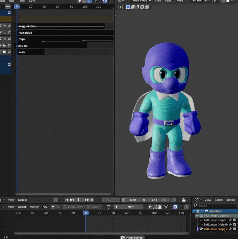
Here is my jumping animation which consists of four layers - the original smoothed keyframes, a baked layer of light physics from the Wiggle Bones addon, the cape flapping on a controllable seperate layer, and finally a subtle noise layer for extra motion. Characters want to feel alive, and the more little things moving around the better.
Another facet of animation I found immensely helpful was the myriad IK and targeting systems available to me. See above where I've layered a head targeting constraint on top of my walk cycle. This is crucial especially for game animation - where bones can be retargeted at runtime to make the player character look at a nearby NPC or grab an item.
The animation I had the most trouble with was the notoriously difficult walk cycle. In my pose-to-pose workflow, it always felt very stiff. My rig lacked the controls I needed for clean leg rotations or proper foot snapping. Here I learned that pose-to-pose isn't always the answer - especially for small looping animations like a walk cycle. I began down the path of adding proper foot controls to my rig an animating it in a cyclic bezier format instead (right), following along with this wonderful demonstration by Doodley.
...But ultimately too much of the animation work was already done for me to drastically change the rig. I was aiming for recreating specific sprite-based poses anyway, so I decided against it - but I do believe it is the better approach.
And of course one last wrinkle for this project specifically is that Smash Brothers characters are like stage actors - they stand horizontally and cheat their bodies out towards the audience, which meant I needed to rework some of my animations to work from that perspective (I.E. - Mighty Dive Bomber isn't actually jumping forwards, he's jumping forwards AND turning his body 90 degrees.) In the below two gifs you can really see the difference between raw bezier'd keyframes and the animation layers I mention above.
THE BOTTOM LINE
I made a promise to myself that I would distill these posts down to actionable learning-prompts for my future reference, so welcome back to the bottom line.
- Work doesn't have to be step-by-step. Get comfortable moving back and forth and/or breaking things if needed.
- Reference is your friend, but design is your guide. Have one.
- Stylized faces have bigger, simpler shapes - but those shapes are also FLATTER.
- When refining, be wary of your volume. Are your details subtractive or additive? How do they alter the silhouette?
- Retopology is easy and it is worth it. Maybe explore pole handling in places such as the finger tips.
- AO passes are worth it - as are extra normal passes, like my new favorite eye normal.
- If called for, make your rig yourself.
- When creating a rig, be wary of your bones rolls and rotations. Keep things clean and locked to 90 degree increments as possible.
- Be sure to include all the controls you'll want - importantly, foot snapping and rolling.
- For weight painting, use easy weights and keep your eye on the tool panels/modes at all times.
- Weight painting is painting. Slow, subtle changes are best.
- When animating, layers are your friend. Overlay physics and noise and mix together animations for quick-n-easy results.
- Pose-to-Pose isn't always the answer, especially for short looping cycles.
- Animate to the camera.
And that's it for the bottom line - if you've read this far - thanks! I hope this was of some interest to you. You can download the finished mighty dive bomber rig here as a reward.
And that's all, folks, until next time!